ITRnarcotic
Dont Ask
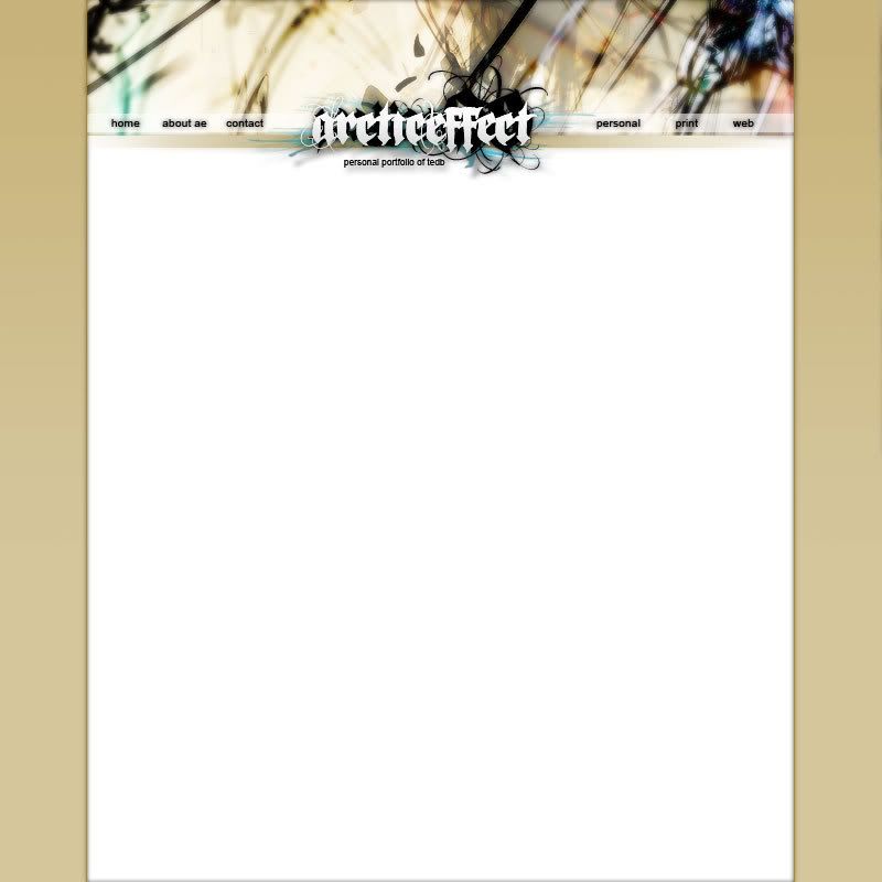
Hey here is the newest layout concept. What do you all think?


I think that's what it needs.I'm pretty partial to a darker gradient running up from the bottom...a dark brownish color running up would look sweet.
lol its supposed to be "about ae" because "ae" is Arctic Effectlooks good
only thing i would suggest if anything at all would be additional links at the bottom and perhaps change the font on the ae in "about ae" first impression it looks as though you had a typo and put ae instead of "about me"

